Arabic Type
Arabic Type
Arabic Type
Arabic Type
Arabic Type
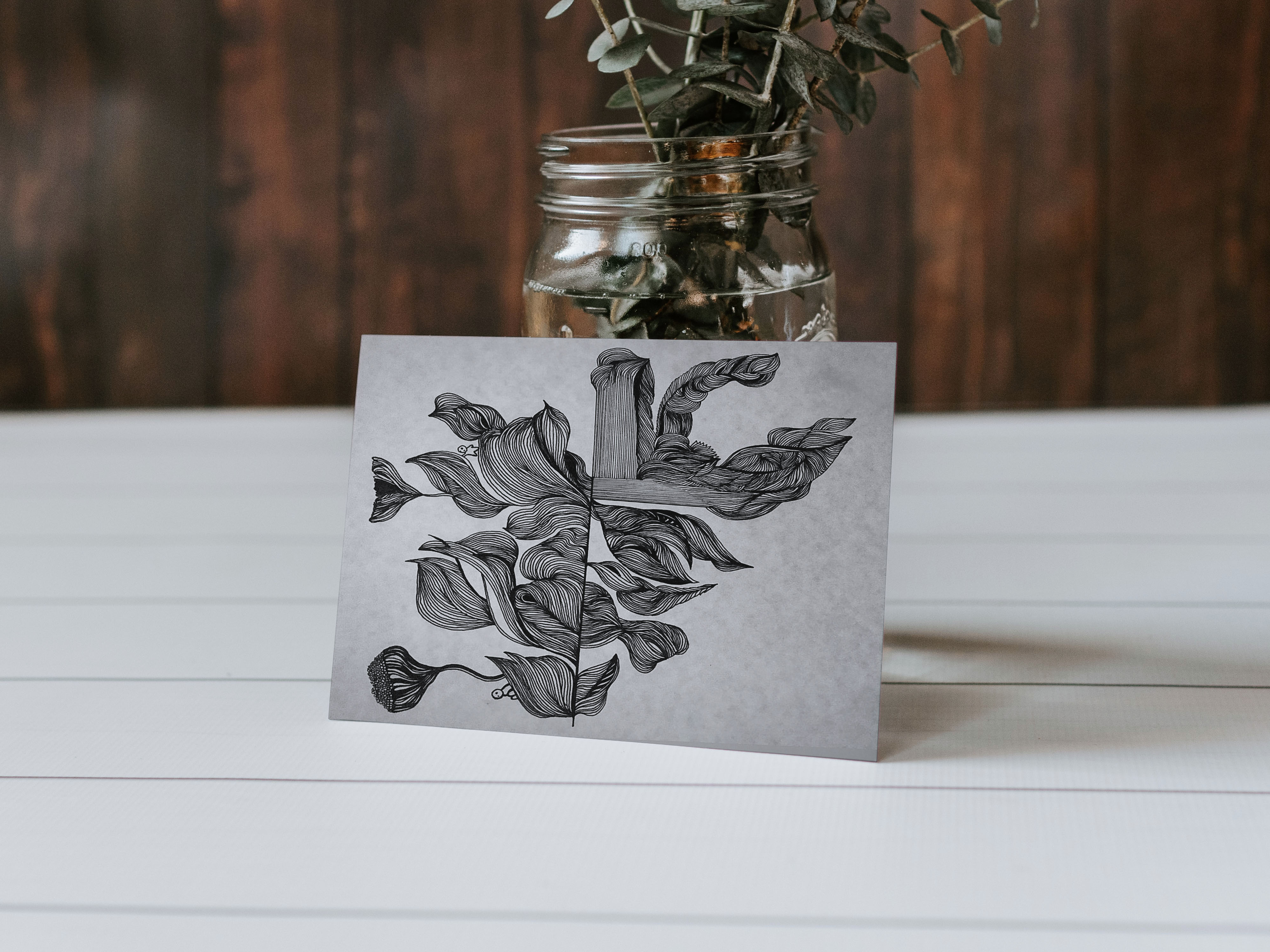
A collection of typographic work. These creations are snippets from projects during my internship and freelance with Kashida Design, a Lebanese product design studio that creates furniture and home accessories based on 3D Arabic typography and lettering.
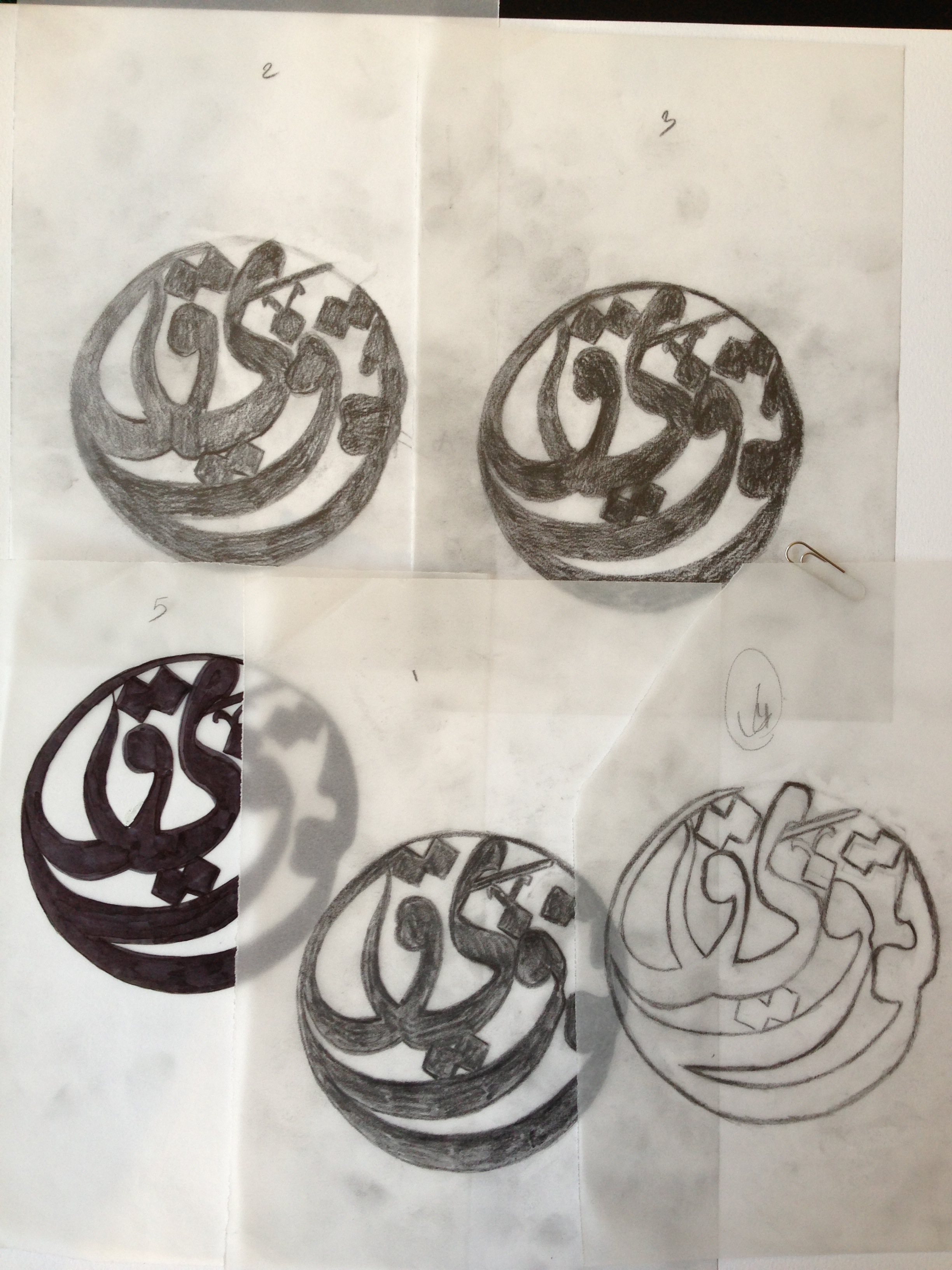
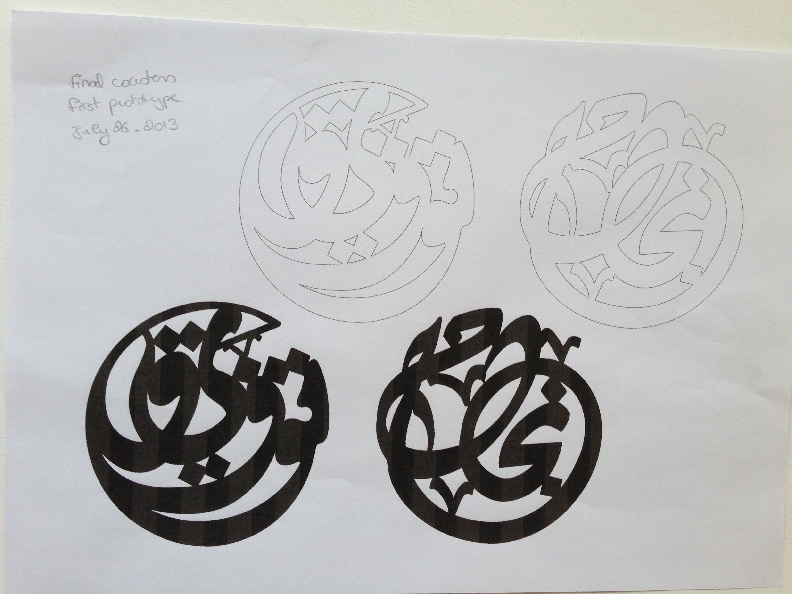
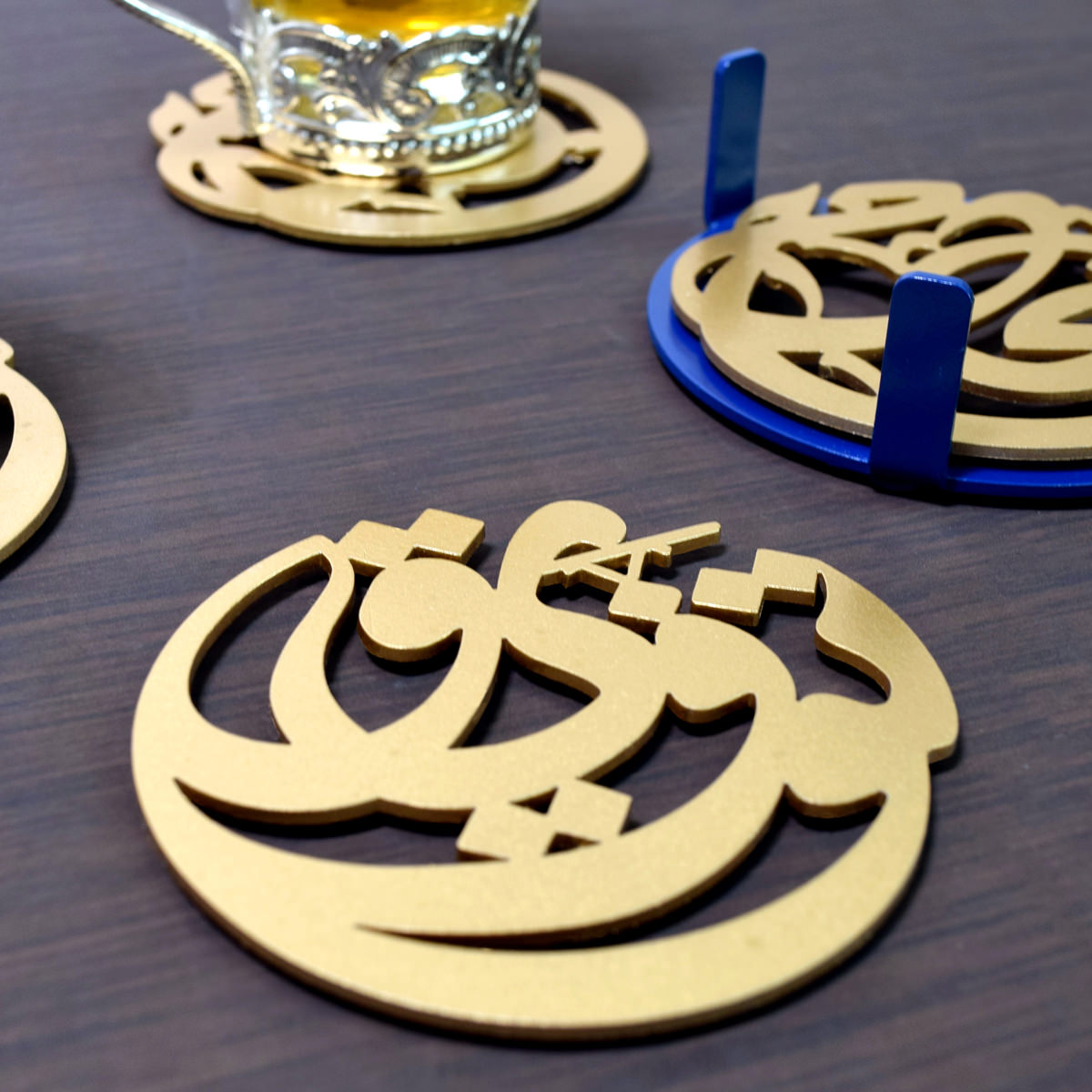
“Tawfic and Najah” coasters are one great example to start with. As requisite for such product, the material picked was thick enough to carry up cups in a stable way, or else it won’t fulfill its function. As a style, the “diwani” calligraphic style thought to work best because of its excessive playful curves and its decorative punctuation that helps tightening the letters together, and creating an organic feel.
The challenge faced during this process of thickening the letters and minimizing the negative spaces, was to preserve the original contrast and proportions of the calligraphic style used, without breaking its internal logic. The thicker and more tied up the letters are, the more the product can maintain its balance and function.
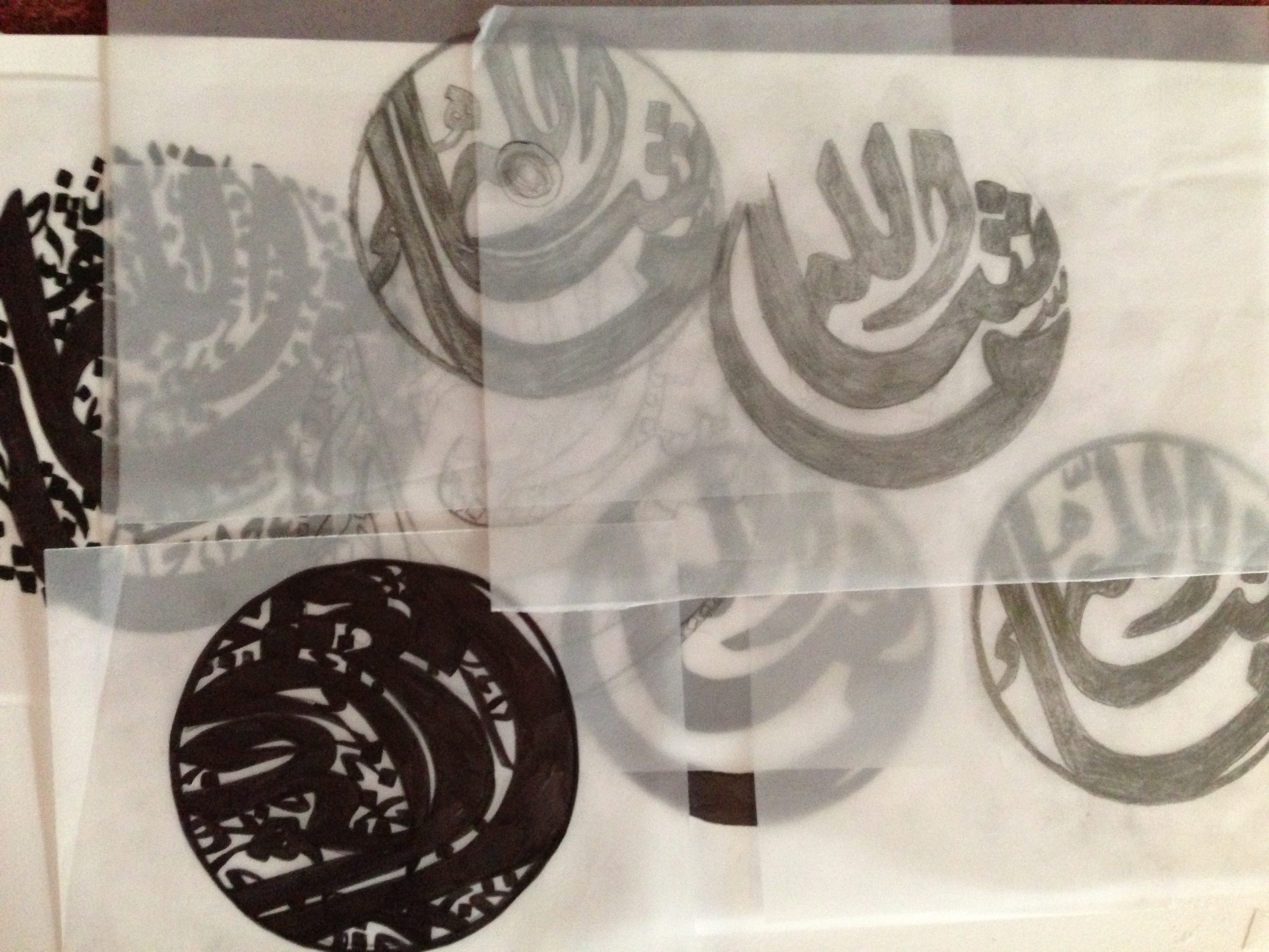
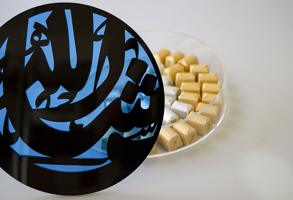
The same process was adapted to another successful product which is “Masha’Allah” box. We had the world written with Diwani Arabic calligraphy and according to this basic sketch, we started stylizing it and playing with its thickness and the positioning of the letters till we reached a satisfying result. The hard and challenging part was to maintain the special characteristics of such a delicate and beautiful style, and to preserve its proportions and its light organic feel yet making it feel steady and slightly bulky.
A collection of typographic work. These creations are snippets from projects during my internship and freelance with Kashida Design, a Lebanese product design studio that creates furniture and home accessories based on 3D Arabic typography and lettering.
“Tawfic and Najah” coasters are one great example to start with. As requisite for such product, the material picked was thick enough to carry up cups in a stable way, or else it won’t fulfill its function. As a style, the “diwani” calligraphic style thought to work best because of its excessive playful curves and its decorative punctuation that helps tightening the letters together, and creating an organic feel.
The challenge faced during this process of thickening the letters and minimizing the negative spaces, was to preserve the original contrast and proportions of the calligraphic style used, without breaking its internal logic. The thicker and more tied up the letters are, the more the product can maintain its balance and function.
The same process was adapted to another successful product which is “Masha’Allah” box. We had the world written with Diwani Arabic calligraphy and according to this basic sketch, we started stylizing it and playing with its thickness and the positioning of the letters till we reached a satisfying result. The hard and challenging part was to maintain the special characteristics of such a delicate and beautiful style, and to preserve its proportions and its light organic feel yet making it feel steady and slightly bulky.

OTHER PROJECTS


© Salma Khalife 2017